THINKSURANCE GMBH

project summary
I designed the core booking experience for a hypergrowth insurtech startup.
Timeline
4 Months
Team
Myself (Lead Product Designer)
1 Product owner
1 Scrum Master
7 Developers
1 UX researcher
Market
Germany
HOW IT WORKS
In the real world, brokers search for insurance policies that fit their clients' needs. This often involves asking questions and collecting documents like inspection reports or property valuations.
For example, Nelson, who runs a catering business, needs insurance. His broker, Daniel, gathers details about the business—its age, number of employees, and specific requirements. Using this information, Daniel identifies the most suitable policy.
Our platform simplifies this process by allowing brokers to compare policies, book insurance, and manage documents in one place, reducing paperwork and streamlining communication.
CHALLENGE & STRATEGY
The Booking Process revamp took place during the second wave of the COVID-19 pandemic, with 90% of the team working remotely across time zones in Asia and Europe. Continuous communication was critical to avoid gaps and ensure smooth collaboration.
The project began in August 2021 by identifying various insurance brokers to understand their workflows and use cases. I collaborated with the Product Owner, who provided a business perspective, and the UX Researcher to gather data and define requirements through brainstorming sessions.
I adopted the Double Diamond Model to guide the team in building, iterating, and delivering efficiently. My contributions addressed key challenges by:
Creating User Flow Diagrams: Ensured developers had a clear understanding and alignment on workflows.
Wireframing User Journeys: Provided engineering with a foundation to build APIs.
Designing High-Fidelity Prototypes: Enabled the team to visualize solutions, validate business requirements, and secure sign-offs for implementation.
Problem Statement
How might we improve the experience for insurance brokers selecting the best policies for their clients?
The solution should enable a seamless, friction-free transition between pages, present relevant information clearly, and empower brokers to make well-informed decisions efficiently.
USE CASES & PAIN POINTS
We identified three major use cases of brokers during our research;
1. Uses the platform for tariff comparison.
2. Uses the platform to generate a proposal document.
3. Uses the platform to book an insurance policy for client.
Below is a persona captured for a Broker detailing motivations and frustrations.
discovering the problem
Along with the UX Researcher and the Product Owner, I conducted user interviews and held brainstorming sessions to;
1. Ask questions about broker processes and establish use cases.
2. Understand pain points in the current solution or daily processes.
3. Validate assumptions that we held about certain workflows and processes.
Some findings
Difficulty re-finding consultations: Locating previous customer or consultation records is time-consuming and inefficient.
Challenges with risk questionnaires:
Users struggle to identify what remains incomplete in the risk questionnaire.
The structure of long forms and multiple question categories causes confusion and impacts usability.
Inconsistent display of calculator results and offers: Differences in how results and offers are displayed make it harder to compare tenders.
No option to share risk questionnaire with clients: Brokers cannot send risk questionnaires to clients for review or feedback, limiting collaboration.
Premium increases causing customer churn:
Brokers need to understand the reason for premium increases.
They must assess whether re-evaluation is necessary, perform it if required, and communicate outcomes to customers.
No way to calculate expired tariffs: The platform does not allow visualization or recalculation of expired tariffs, making it harder to manage and reassess them.
Opportunity
Getting this process right was critical as it formed the foundation of the platform. Additionally, it presented a significant opportunity to drive business value by increasing GWP, the company’s key revenue metric. Addressing these challenges would also support customer growth, improve retention rates, and meet market demand effectively.
Areas of focus
Following discussions with product owners and executive management, we identified and prioritized key areas of the platform that balanced business impact with feasibility, considering available resources and timelines:
Harmonized results page: Redesign the results page to display calculator outcomes and tender offers more intuitively.
Revamped information architecture (IA) and design for product page: Improve structure and usability for better navigation and clarity.
Streamlined booking process: Split the booking process into two distinct flows: Cover Order and Proposals, and organize information into steps.
Introduction of a review page: Allow users to review and confirm details before finalizing actions.
Improved success page: Design a more intuitive success page to enhance user experience post-completion.
defining the problem
I collaborated with the team to translate all the requirements and processes into user flow diagrams.
These diagram helped us have a better process visualization of how users navigate through the platform and and allowed us quickly spot inefficiencies.
This also was useful to hold discussions with engineering to align and ensure that these flows were indeed feasible for implementation.


EXPLORATIONS
I took an iterative approach to designing pages and flows, maintaining constant communication with the team to ensure optimal user experience. I collaborated with the UX researcher to conduct A/B tests, quickly validating assumptions and refining designs based on feedback. Each flow was detailed and evaluated with the team to weigh pros and cons before finalizing.

Result Page
After selecting a product(s), user get to the results page where they can view the tariffs for those product they’ve selected as well as compare between two tariffs.

Risk Questionnaire
To get to the results page, broker needs to fill in a risk questionnaire. This is to have an accurate representation of the business broker is trying to insure, the calculator then analyses these questions and presents a list of relevant tariffs based on the analysis in the results page.

Booking Flow
The booking flow is the final piece of the puzzle. After selecting a tariff(s) brokers can either send this as a proposal to client for review (not legally binding) or they can proceed to actually book this tariff for the client (legally binding).
Success Page
The success page presented several improvement opportunities:
Track abandonment rates to identify where users drop off.
Provide booking status updates with clear next steps for brokers.
Generate policy documents for brokers automatically.
Introduce tools to measure customer satisfaction.

OUTCOME
The result is a revamped, scalable platform featuring a data-driven questionnaire page, product page, results page, and booking flow tailored to diverse scenarios.
The app is live and my solution is used by thousands of brokers across Germany: https://app.thinksurance.de
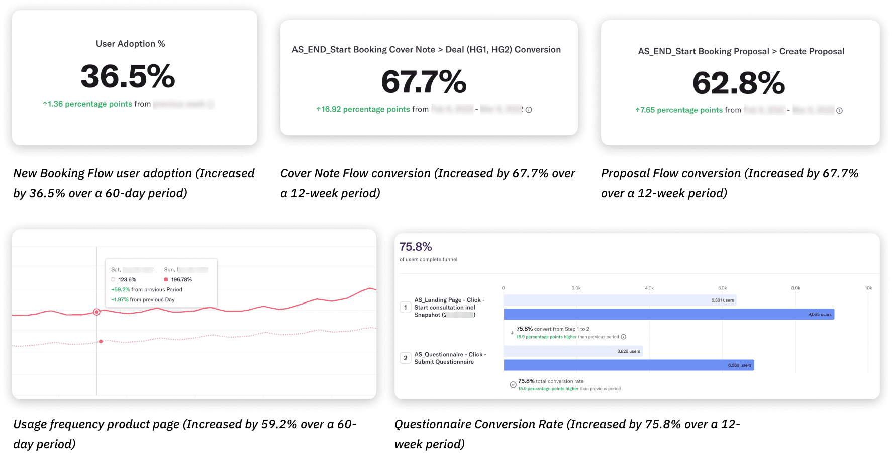
Success Metrics
As our platform continues to grow in popularity among brokers and insurance policyholders, here are some metrics used to track success:
1. Customer Growth (acquisition): # of new users
2. Activity: #active users, time between activities, active sessions
3. User satisfaction: NPS, Usability score
4. Customer Loyalty: Retention rate, churn rate
5. Revenue growth: Conversion rate, GWP
Analytic tools we use include Heap, Hotjar, Mouseflow.
key learnings
Adapting to change is crucial
New timelines, resourcing issues, and reprioritization meant the scope of the project was constantly changing. I had to adapt to those changes and still deliver the best design in time within constrained timelines.
Always fight for good UX
Don’t overpromise and underdeliver
I learned how to define a true MVP vs. something that is simply not usable and therefore not shippable.

